Founded by a determined mother facing a lack of options in state-run care, Avery’s House offers a supportive living environment that promotes independence, inclusion, and a sense of community for adults with intellectual and developmental disabilities (IDD).
The organization is distinguished by its commitment to fostering independence, and creating a warm and inclusive community where individuality is celebrated. Avery’s House prioritizes basic care and holistic well-being, focusing on skill development, community engagement, and healthy living.
The brand’s requirements: charming, inviting, soft, inclusive, joyful, empowering, professional
The Avery’s House brand needed to be inviting, clean, professional, and stand out among organizations offering similar services.
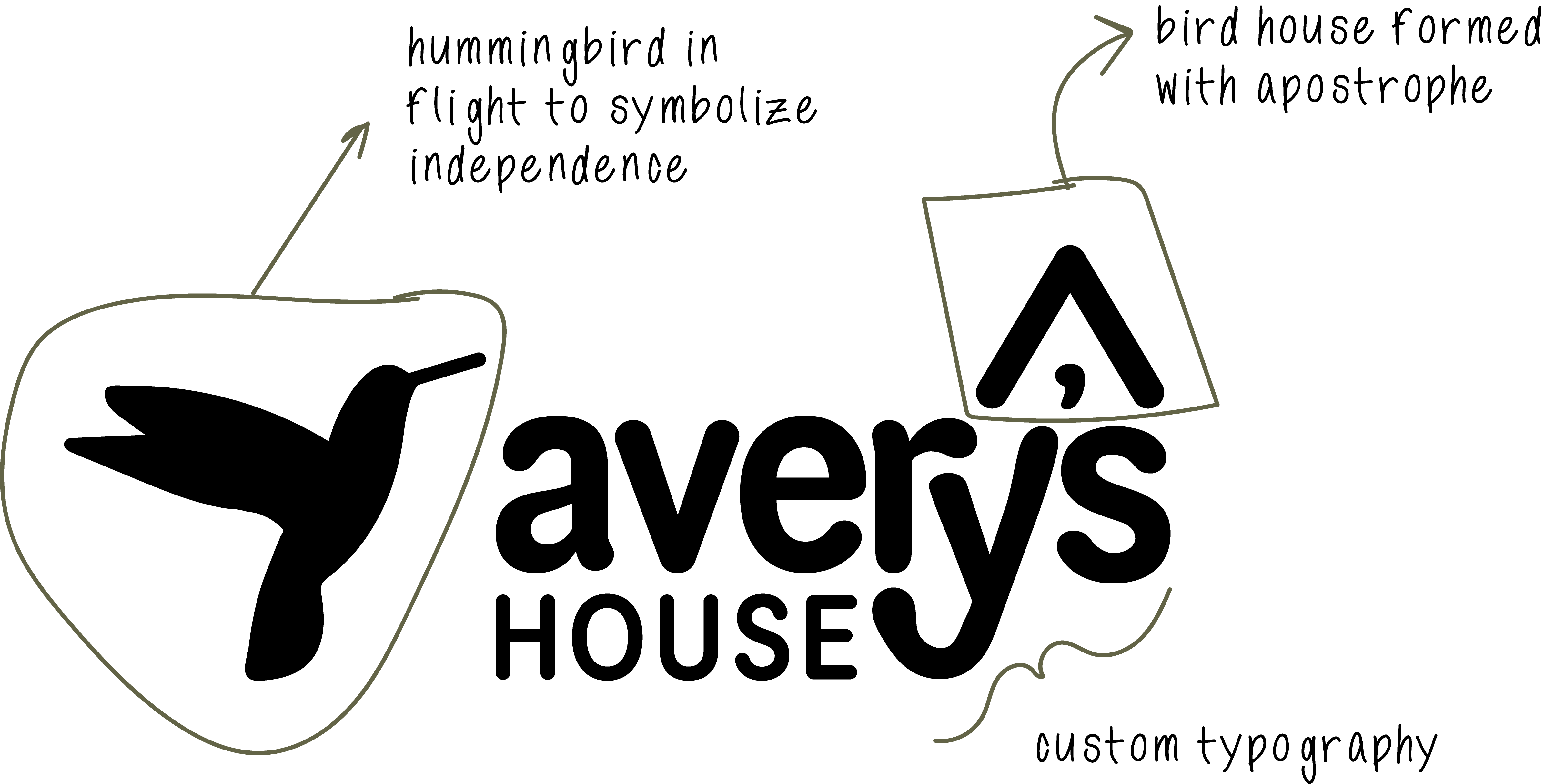
Many organizations involved with IDD individuals utilize heart imagery in creative branding and design materials. We differentiated by focusing on the natural environment.
The hummingbird speaks to independence – it is a bird in flight. The roof over the apostrophe symbolizes the physical house – and simultaneously speaks to the name Avery.
BRAND DETAILS
The pieces of the logo easily lend themselves to standing alone as brand marks for social media profiles, branded graphics, and other designs that require a small brand.
COLOR PALETTE
Nestled in the scenic mountains of Southern California, Avery’s House is surrounded by a sage-soaked landscape. We paired that color with an inviting cream and added a fun accent color for pop, Bramble – an ode to the heart-filled imagery of similar organizations. Cream serving as the second-in-command color, with intellectual differences.
WEBSITE DESIGN
The Avery’s House website is mobile-friendly, easy-to-navigate, and loaded with content to get it higher in organic search results.
We used lots of imagery about the house and its residents
"It is a dream of mine to see this come to fruition."