Your website is often the first real conversation you have with a potential client. The financial advisors filling their calendars with perfect-fit clients have figured out how to make that conversation count, and it starts long before anyone picks up the phone.
When your website reflects your more personable characteristics, speaks directly to the people you most want to serve, and looks different from your competitors’, everything downstream gets easier.
You’re in the right place because our specialty at Growth Story is bringing in design and copywriting elements that humanize your brand so it appeals to the modern consumer.
This is what high-quality website design for financial advisors looks like when it’s done right:
Why So Many Financial Advisor Websites Look the Same
There’s a reason you can open ten financial advisor websites in a row and struggle to tell them apart.
Financial advisors operate in a heavily regulated industry where trust is everything. When someone is handing you their retirement savings, their kid’s college fund, their newly acquired inheritance, or their entire financial future, you need them to feel safe. That’s just the nature of the work you do.
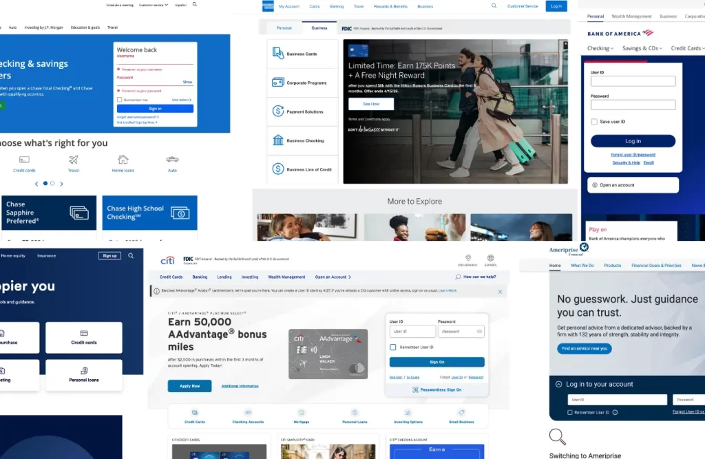
Over the years, the color blue has been psychologically applied to the concept of trust. Consider the brands for American Express, Chase, Citi, and Bank of America. Each of them use a blue-based color palette.
The problem is that this big bank color psychology has trickled down to independent financial service providers who typically serve a smaller client base that wants a little bit more of a custom approach. So when financial advisors purchase a website template specifically marketed to financial advisors, they all end up with websites that look very similar. And these blue-washed websites are doing nothing to differentiate you from your competitor down the street.
Your clients didn’t come to you because they wanted the experience they got at Chase. In fact, they might be leaving Chase after an impersonal experience that left a bad taste in their mouth. What they want is something more personable that speaks to your level of client service and expertise.
What Strong Website Design Does for Your Financial Advisor Group
Standing out as a financial advisor means more sales, better referrals, and a calendar full of clients who were looking for exactly you.
When your website breaks out of the template mold and uses language that sounds like something real humans would say, something shifts and it shows up directly in your prospect conversions.
Forms trust faster
When someone lands on your site and it still communicates expertise and credentials but also shows empathy and personality, it feels different immediately. Visitors feel comfortable. They think, Wow,this person gets what I’m going through and they have the credentials to back up their expertise. I feel like they would be able to do the work I need them to do.
The right people self-identify.
When your site shows more human and personable content, it resonates with a specific type of client. People who value clarity, honesty, and a real relationship start lining up. This content is what warms people up before they book a meeting so that when they show up to your first consultation, they already feel like they know what you’re about and how you work..
Your conversations get easier, and your close rates go up.
When prospects land on your website already feeling understood within five seconds, closing conversations get a lot easier. They’re not interviewing another advisor, they’re continuing a conversation they already started while scrolling through your website. Discovery calls become less skeptical and a lot more productive.
Standing out is how your business’s Growth Story really begins.
How Copy Makes or Breaks Your Financial Advisor Website
Standing out as a financial advisor is more than a flashy logo or a bright color palette. It works best by making someone feel, within the first few seconds of landing on your website, “this was written for me.”
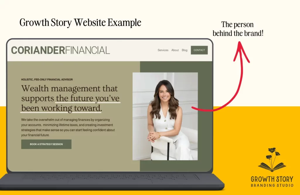
Look at how Coriander Financial Group opens:
With this headline, we’re leading with the thoughts Coriander’s most ideal clients are having when they’re searching for a financial advisor. The key is to lead with their story, not your own.
When you lead with your own story, imagine your prospects eyes glazing over. They didn’t come to your website to learn about how many years of combined experience your firm has. They want to know how you can help them solve their problems or reach their desired state.
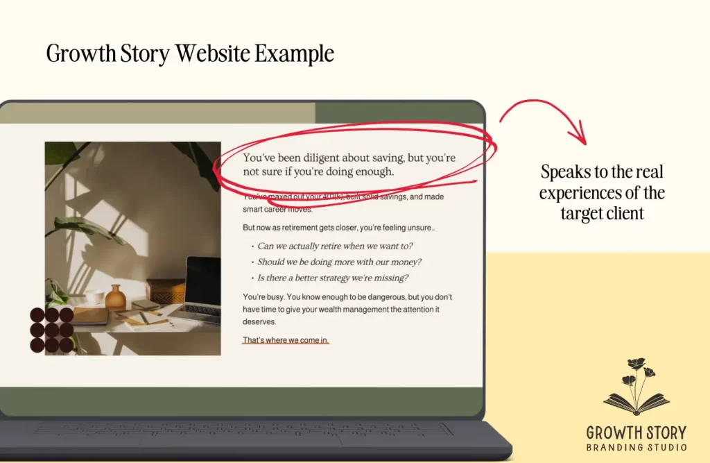
Here’s another example from a website we did for a Certified Divorce Financial Analyst:
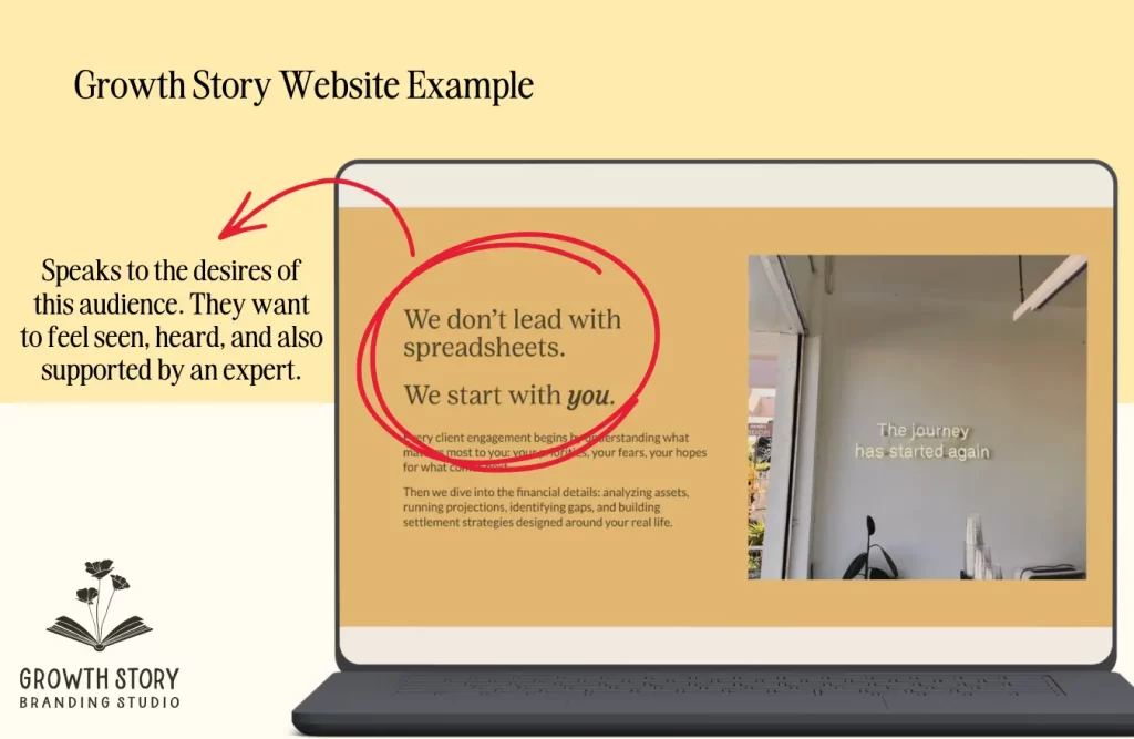
A single line that immediately differentiates from the experience prospects may have had at a different firm and speaks directly to this CDFA’s personable approach.
This website names common fears of divorcees directly: “What if I don’t understand the financial implications until it’s too late?” Here, we’re acknowledging the emotional weight of a major life transition and saying: “we see that, and we’re equipped for it,” long before selling them anything..
That’s what modern financial professional branding looks like when it’s done well. You don’t have to sacrifice professionalism for being more human.
P.S. did you notice something about both of those examples? No blue.
Website Design and Features That Build Trust With the Right Clients
Your copy can be brilliant, but if your design undercuts it, visitors won’t stay long enough to read it. The visual experience of your website is a trust signal before a single word is processed. High-quality brand and website design signals that the firm is successful enough to invest in their client experience as early as the first hello.
Here’s what you should focus on:
Design that communicates credibility without being cold
Clean layouts, intentional typography, and a color palette that feels considered rather than the default Financial Blue go a long way. The key is to make it feel like your version of professional. That means your brand colors, photos of your real office, your actual face, and your authentic personality showing up in the design.
Real photography over stock images when possible
Stock photos aren’t inherently bad. Sometimes they’re the best tool for the job, especially when you’re building out a page and haven’t had a full brand photoshoot yet. But a stock image of two people shaking hands over a mahogany desk covered in charts doesn’t tell a visitor anything about you.
If you’re going to use stock, make it good. You can even customize stock images with brand color overlays, adding graphic elements, doodles, textures, or on-brand patterns. Small moves like these transform a generic photo into something that feels like it belongs on your website and signals to visitors that intentionality went into the design..
User Experience (UX) features that convert prospects
Trust is built through experience. A site that loads slowly, buries the contact button, or forces visitors to hunt for basic information erodes confidence bit by bit. The advisors with the highest-converting sites make the next step obvious at every scroll. Things like one clear CTA per section, a mobile experience that doesn’t feel like an afterthought, and clear ways to learn more can go a long way. These might feel like extra bells and whistles, but they’re the difference between a visitor who books a call and one who closes the tab.
SEO for Financial Advisor Websites: Show Up Before They Know They Need You
When most financial advisors think about SEO, they go after the same searches: “financial advisor near me,” “wealth management firm,” “fee-only financial planner.” Those are worth targeting, but they’re also crowded, and the people typing them into Google often already know what they need.
There’s a whole other category worth your attention: people who haven’t searched for a financial advisor yet because they don’t know that’s who they need..
They’re searching for things like:
- “How to know if I’m saving enough for retirement?”
- “What to do with an inheritance?”
- “Should I pay off my mortgage or invest?”
They’re looking for answers to a problem they’re worried about right now.
This is where a blog strategy earns its keep. When your content shows up for those searches and actually helps someone think through their situation, you become a trusted voice before they ever consider booking a call. By the time they’re ready for professional guidance, you’re someone they’ve been reading for months.
The advisors who build this kind of content pipeline tend to find that their inbound leads arrive warmer, ask better questions, and are already halfway sold because the relationship started long before any sales conversation did.
Start here for financial website design services
The financial advisors who win in 2026 are the ones whose clients say, “I knew you were the right fit before I even reached out.”
That happens when your brand reflects who you really are: a human who just happens to be exceptionally good at what they do.
You can be fun when the moment calls for it. Deeply empathetic when a client is navigating something hard. The most knowledgeable person in the room and still able to explain things in plain language.
Your personality is what makes your credibility memorable. And memorable is what gets you referrals.
If your website currently looks like everyone else’s, that’s just the starting point. The goal is a site someone could screenshot and recognize immediately — without seeing your name or logo — because it is unique to your firm.
Growth Story creates modern websites for independent financial advisors and small firms. We start every project with a strategy session and create a comprehensive brand strategy you can start implementing right away. We’ll dig into who you are, who you serve, your mission and values, and what makes you the obvious choice. Then, we use that strategy to develop a stand-out visual brand, create an SEO plan that captures your clients when they’re seeking you, and build a website that works to bring in new prospects so you don’t have to rely on referrals alone.
Sound good? Let’s start with a quick call to get to know each other and make sure it’s a good mutual fit.
Frequently Asked Questions About Financial Advisor Websites
Website templates are a good place to start, but a custom website is what allows you to turn your site into a conversion tool for your firm. Custom sites include the brand strategy development, messaging guidelines, brand voice guidelines, search engine optimization (SEO) and generative engine optimization (GEO) research as well as a professional designer to make sure the end product is cohesive. We usually recommend advisors get a few clients and 1-2 years under their belts before investing in a custom website.
The biggest difference between a financial advisor website that blends in with the masses and one that stands out is strategy-backed customization. That means strategic and SEO-strategized copywriting in a voice that’s clear and human, choosing photos that show who you are, and being specific about who you help and how.
At minimum: a homepage that speaks directly to your ideal client and a clear services page. Also, an About page that explains your approach and credentials, and a simple way to book a call. Bonus SEO points if you have a blog that covers topics your clients are actively searching for.
Any time your services, niche, or client focus shifts. Blogs with consistent new content keeps your SEO healthy and gives prospects a reason to keep coming back. Frequent updates to your website tells Google and other search engines that the content is fresh. It also signals to prospects that the business is active.
We recommend Squarespace for almost all of our clients in professional services. Reasons: it is user-friendly, integrates with other tools (i.e. your client management system), SEO and accessibility.